If you are a (business administration) student you might ask yourself the question ‘Why should I learn programming (when I can spend time on learning something else)?’ or, the more painful question ‘Why should I learn programming (when others, like computer science students, can do it better than me)?’ I think it’s important to answer these questions so you don’t just stumble into programming because you have to for a course, but rather, you see a meaning behind this activity.
Recently, I sat through a presentation given by representatives of an auditing company. At one point, one of the presenters showed a slide with the software used by the auditors of that company. On the slide there were at least ten logos of software, from PowerBI to Dataiku. Extrapolating from this example, we can conclude that the auditor is used to working with different forms of software, some of which can be quite complex. Will the software remain the same throughout the working lifetime of the accounting professional? (btw., I’ll use interchangeably ‘accountant’ and ‘auditor’ although there are some differences in the tasks performed by these two groups) The answer is a resounding NO. If there is anything certain about a profession, especially in a profession heavily affected by digital technology, is the fact that the working parameters will change and there are always new things to learn.
In his book Deep Work: Rules for Focused Success in a Distracted World, computer scientist Cal Newport points out that one core ability to thrive in the New (digital) Economy is ‘the ability to quickly master hard things’. But what is the ‘hard thing’, the new skills, that we need to master? At the World Economic Forum Annual Meeting of 2023 in Davos, the skill that was hailed as fundamental for the workplace which is being transformed by digital technologies, was the ability to communicate with people and machines. What is programming if not a form of communication with machines? What is programming if not a form of communication with people who work with machines, such as data analysts and computer scientists?
Next, I’m going to recollect another presentation that I attended and is useful for understanding the ‘why’ behind programming. This time, the presenter was a data scientist giving a presentation on ‘Data analytics for auditing’ to experienced auditing professionals. The presentation of the data scientist contained many examples of how data analytics can improve the work of an auditor (e.g., gain new insights on clients, work more effectively, work more efficiently). Still, at the end of the presentation, the auditors were still baffled about the possible uses of data analytics. The issue was that the data scientist showed the auditors what can be done with data analytics but not how to do data analytics. In order to actually ‘do analytics’ you need to learn how to program. Not knowing how to program reduces your understanding of data analytics. It’s like walking on the street and seeing a shining object on the asphalt - you cannot know if the shiny object is a coin or the cap of a bottle until you physically walk to the shiny object. Imagine that programming is your metaphorical ‘walk’ to data analytics - you can only do data analytics when programming brings you in ‘the proximity’ of data analytics.
2.1 Beginning step
If you have internalized the fact that programming is a skill worthwhile learning, then how do we go about learning it? Here, we’re in luck. There are so many wonderful free resources on this, from the ‘R for Data Science’ work of Hadley Wickham to R base ‘fasteR: Fast Lane to Learning R!’ approach of Norm Matloff. Want more? There is even a ‘Big book of R’ by Oscar Baruffa where many open R resources are indexed.
You see already that the programming language of choice is R. I think that J. Christopher Westland in his book Audit Analytics: Data Science for the Accounting Profession (Use R!)(Westland 2020) makes a very good argument for the choice of R (as opposed to Python). You can read this in the chapter on Fundamentals of Auditing Financial Reports.
The first step in learning how to program in R is to install R. Next, install RStudio. If you haven’t done this before, I recommend following alone the material provided by the Sydney chapter of R-Ladies: RYouWithMe.
2.2 Let’s visualize data
The R for Data Science (R4DS) book of Hadley Wickham, Mine Çetinkaya-Rundel and Garrett Grolemund has Data visualization as the first chapter after the introduction chapter. This chapter placement underscores the importance the authors place on data visualisation. Data visualisation is a fundamental step in any analytics endeavour and more importantly, it gives you tangible results in the form of nice graphs that can motivate you to continue to program. Before diving in the more advanced R used in the book Audit Analytics: Data Science for the Accounting Profession (Use R!)(Westland 2020), we’ll focus on data visualization in order to warm up our programming muscles.
The R ggplot2 package is praised by many for its great structure and flexibility. When Hadley Wickham created the ggplot2 package, he thought of visualizations as a sort of grammar. Similar to how in grammar we have specific concepts and rules (e.g., how to connect the noun with the verb), in ggplot2 we also have concepts and rules. The most important concepts that ggplot2 works with, in a very concise list, are:
mappings (between data and graph elements, also called aesthetics)
geometrical objects or geoms (ways to represent the data, like lines or points)
coordinates (not super relevant for us as we’re mostly going to use the Cartesian coordinates but, just so you know, you can change these coordinates to plot maps, for example)
scale (this helps us make the connection between variables in the data and aesthetics in the graph; when, for example, we want to show the x variable in the log scale we can use scale_x_log10())
statistical transformation (sometimes we might want to show a statistic for the data, like the maximum or mean of the data so we’ll use stat = "summary")
facet (when we want to see data in different panels)
position (when we want to adjust the position such that, for example, the points from geom_point are not overlapping but are dodged)
other important function used frequently are labs() for labels and theme_ for changing general settings of the graph like removing grid lines.
Let’s work through a step-by-step example.
First, let’s imagine some data. We’ll load the tidyverse package in order to be able to use the tibble function.
The first step in our visualization is to initiate the ggplot function, communicate the data and make the 1. mapping from the data to the x and y axis.
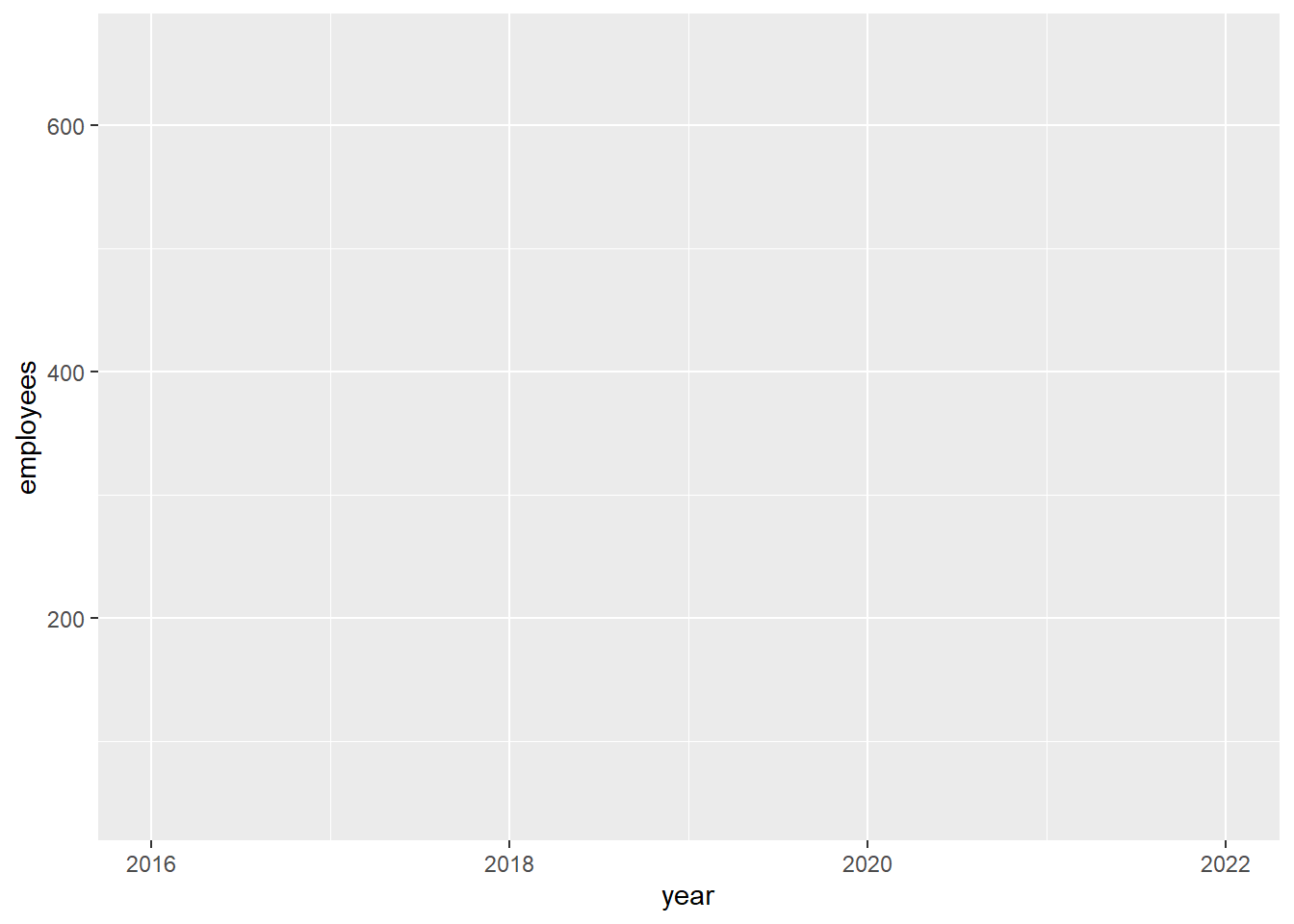
ggplot(data = df_employees,mapping =aes(x = year, y = employees))
The graph appears but it is empty because we did not specify how to draw the graph, using a line, a point, a bar. We’ll need to specify a 2.geometrical object. We’ll add this geometrical figure using the + (plus) sign.
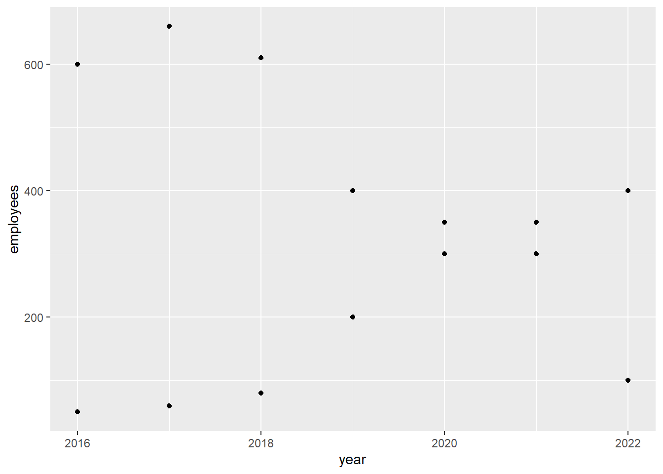
ggplot(data = df_employees,mapping =aes(x = year, y = employees)) +geom_point()
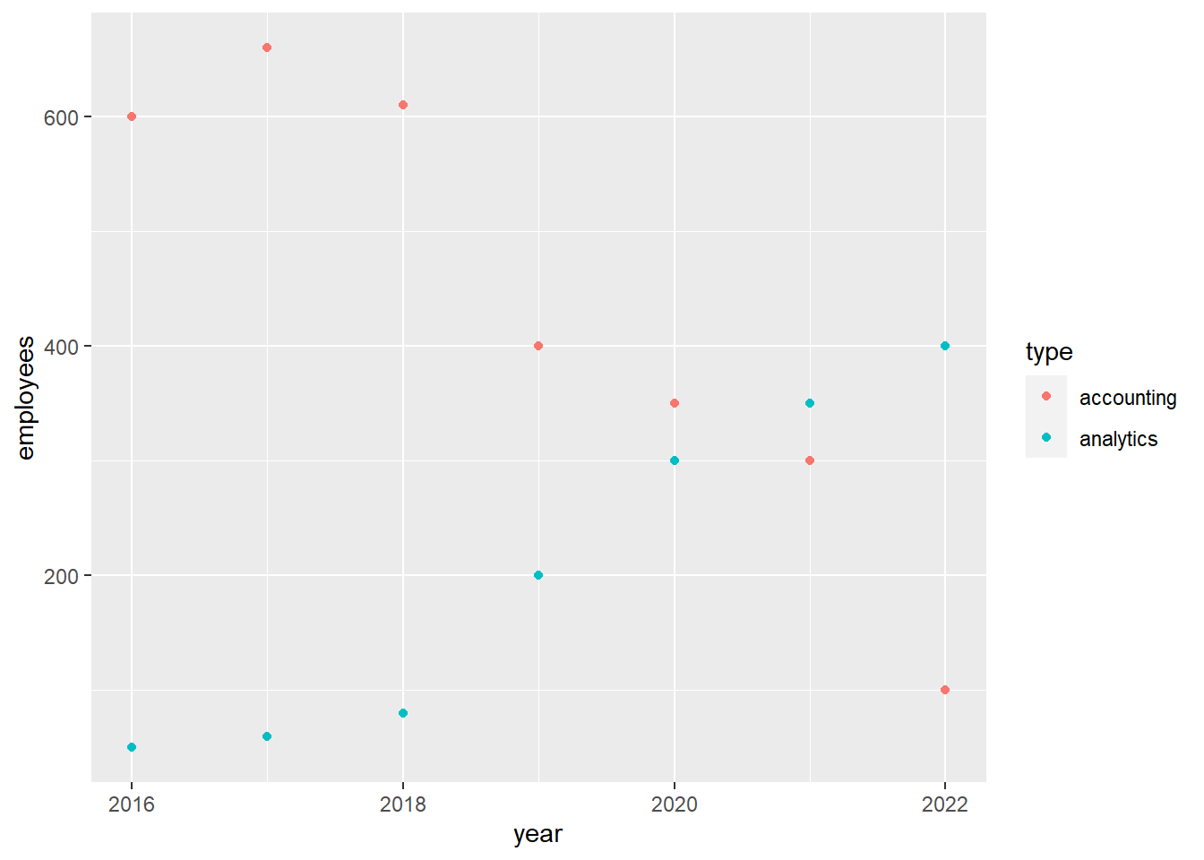
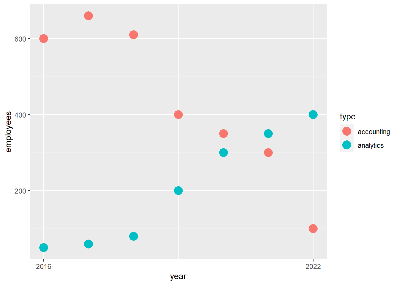
But wait, the graph is a bit confusing because it does not show the type of employee. We can show the type by mapping the variable type onto the aesthetic color.
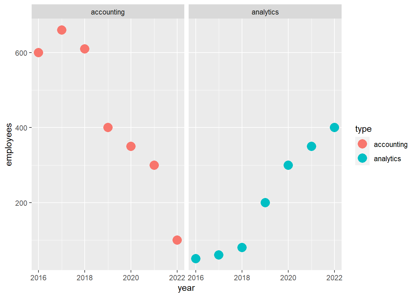
We might decide that we want to show accounting employees and analytics employees on different graphs. For this, we can use 6.facets in a new layer of visualization which is again added with the plus sign +.
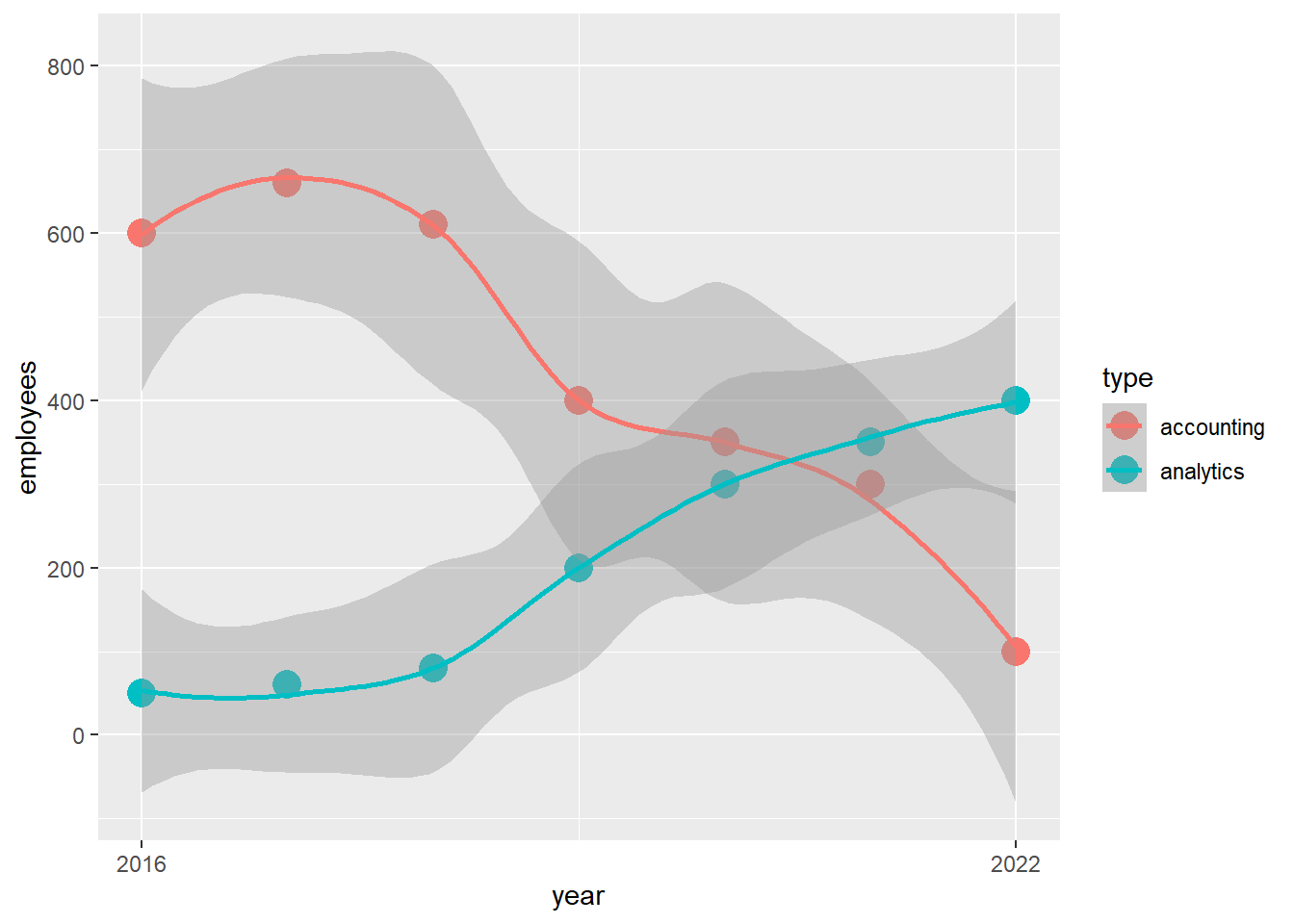
Nevertheless, the faceting does not add to our understanding of the data because we want to visualize the trends together. So, we’ll take it out. Instead, we might consider that, in order to eliminate graph elements which are not super relevant, the x axis should show only two years, the first and last year. Then, we’ll adjust the 4.scale between the data and the aesthetics.
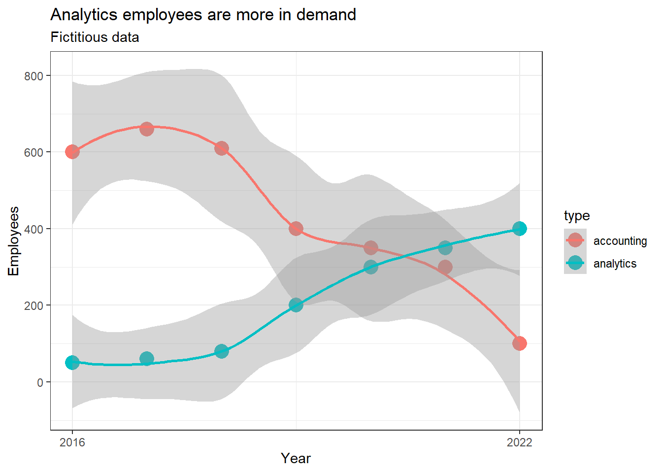
We can further change the 8.theme of the graph, to eliminate the background grey, and add labels.
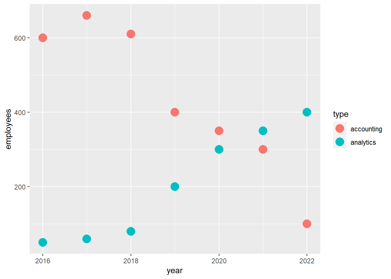
ggplot(data = df_employees,mapping =aes(x = year, y = employees,color = type)) +geom_point(size =5) +scale_x_continuous(breaks =c(2016,2022)) +stat_smooth() +#to eliminate grey backgroundtheme_bw() +#to add labelslabs(title ='Analytics employees are more in demand',subtitle ='Fictitious data',x ='Year',y ='Employees' )
In this graph we have not change the 2.coordinate system as it did not make sense. We also did not use 7.position such as position_dodge which is used to disentangle points, as the data I created has too few data points.
That’s it! Great job!
Do you want to know more about ggplot2? Then check out the ggplot2 book.
2.3 Questions and applications
The Storytelling with data : a data visualization guide for business professionals book by Cole Nussbaumer Knaflic is great. Through this wonderful book, Cole Nussbaumer Knaflic makes the point that communicating with data does not need to be dry and complex. Even more, communicating with data can be seen like telling a story! Test your new ggplot skills on one of the visualizations in Knaflic’s book. Use ggplot (and, optional, the information presented in chapter 2 of R for Data Science (2ed)) and re-create figures 8.1, 8.5, 8.16, 8.19 from the Storytelling with Data book. In order to recreate the figures use rough numbers from figure 8.1. Push yourself such that the figures recreated are as similar as possible with the original figures (e.g., contain axis labels, titles, text).
Hadley Wickham is also known for his tidy data principles. It’s important to know that many people, especially data analytics novices, struggle with the analysis of data because the data is not tidy. Tidy data has one variable per column (e.g., student_name, student_number) and one observation per row (e.g., Dima, 1234). In this application, we’ll make some data tidy!
First, we create some ‘messy’ data.
library(tidyverse)company_names <-c('Absolute first','Because we care','Constraints breed creativity')profit_2021_mil <-c(10,20,40)profit_2022_mil <-c(15,12,44)#make a tibblesim_data <-tibble(company_names,profit_2021_mil,profit_2022_mil)#view datasim_data
# A tibble: 3 × 3
  company_names                profit_2021_mil profit_2022_mil
  <chr>                                  <dbl>           <dbl>
1 Absolute first                            10              15
2 Because we care                           20              12
3 Constraints breed creativity              40              44
sim_data is an example of untidy data. Why? Can you make the data tidy?
Read the chapter Fundamentals of Auditing Financial Reports from Westland (2020) . Based on this chapter, what are the benefits of using R for a business student? What information can we find in accounting files? How does information technology impact accounting and auditing?
Read the chapter Foundations of Audit Analytics from Westland (2020). Work to reproduce the code describing different data types and formats from pages 24-38 . Based on this work:
Identify parts of the code which are unfamiliar to you.
Can you give an example of structured or unstructured data?
Can you give an example of numeric, continuous data?
Can you give an example of numeric, discrete data?
Can you give an example of categorical, ordinal data?
Can you give an example of categorical, binary data?
Can you compare matrices with arrays and lists?
Westland, J. C. 2020. Audit Analytics: Data Science for the Accounting Profession. Springer Nature.